Lille Opera
WIP responded to the competition aimed at transforming the identity of the Lille Opera.

As a starting point, opera is alive, sonorous and vibrant.
Why should its identity be fixed and silent?

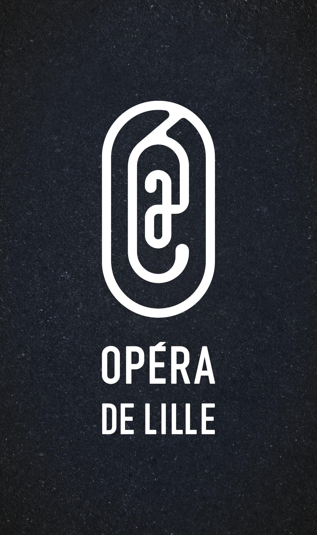
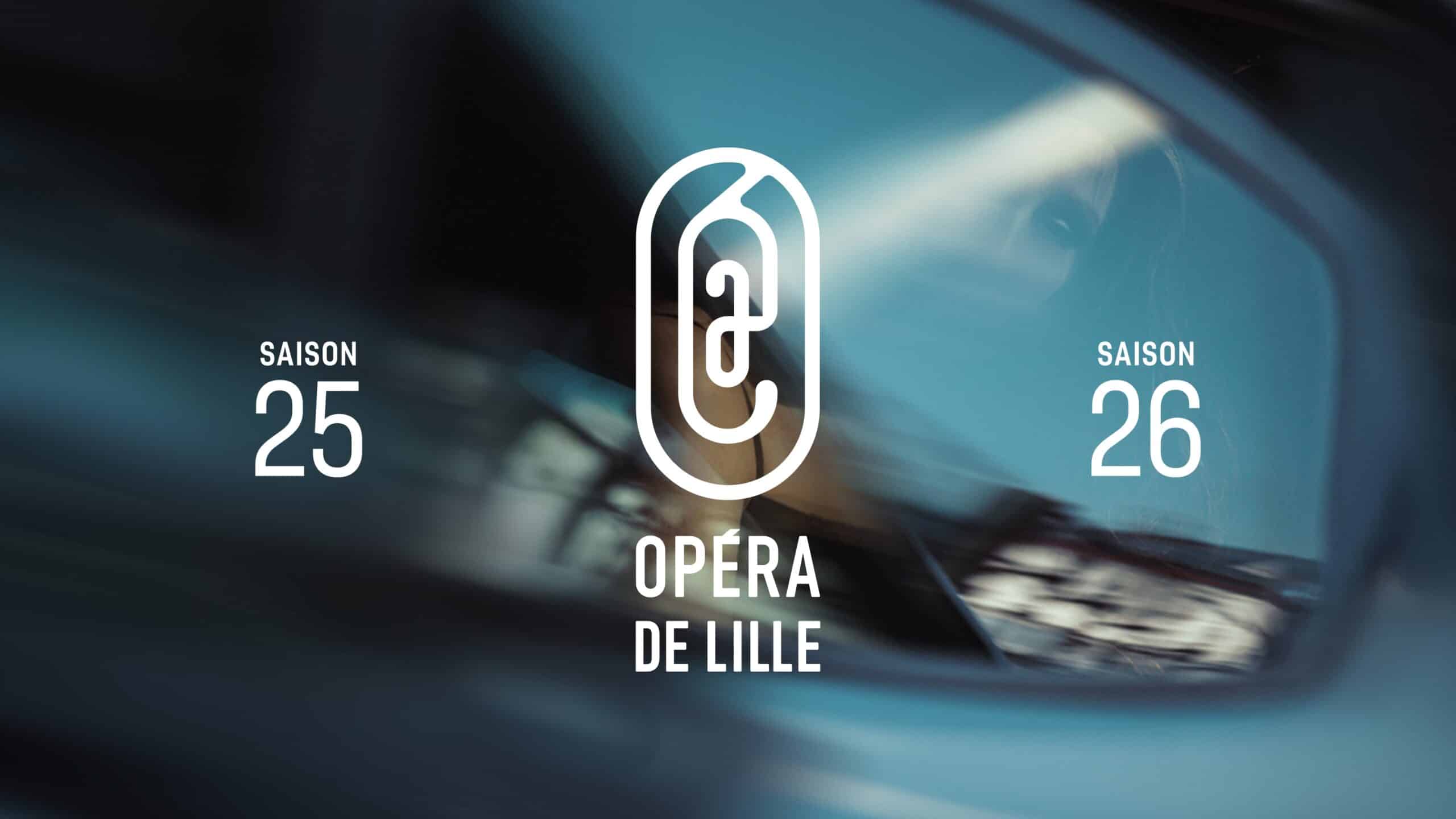
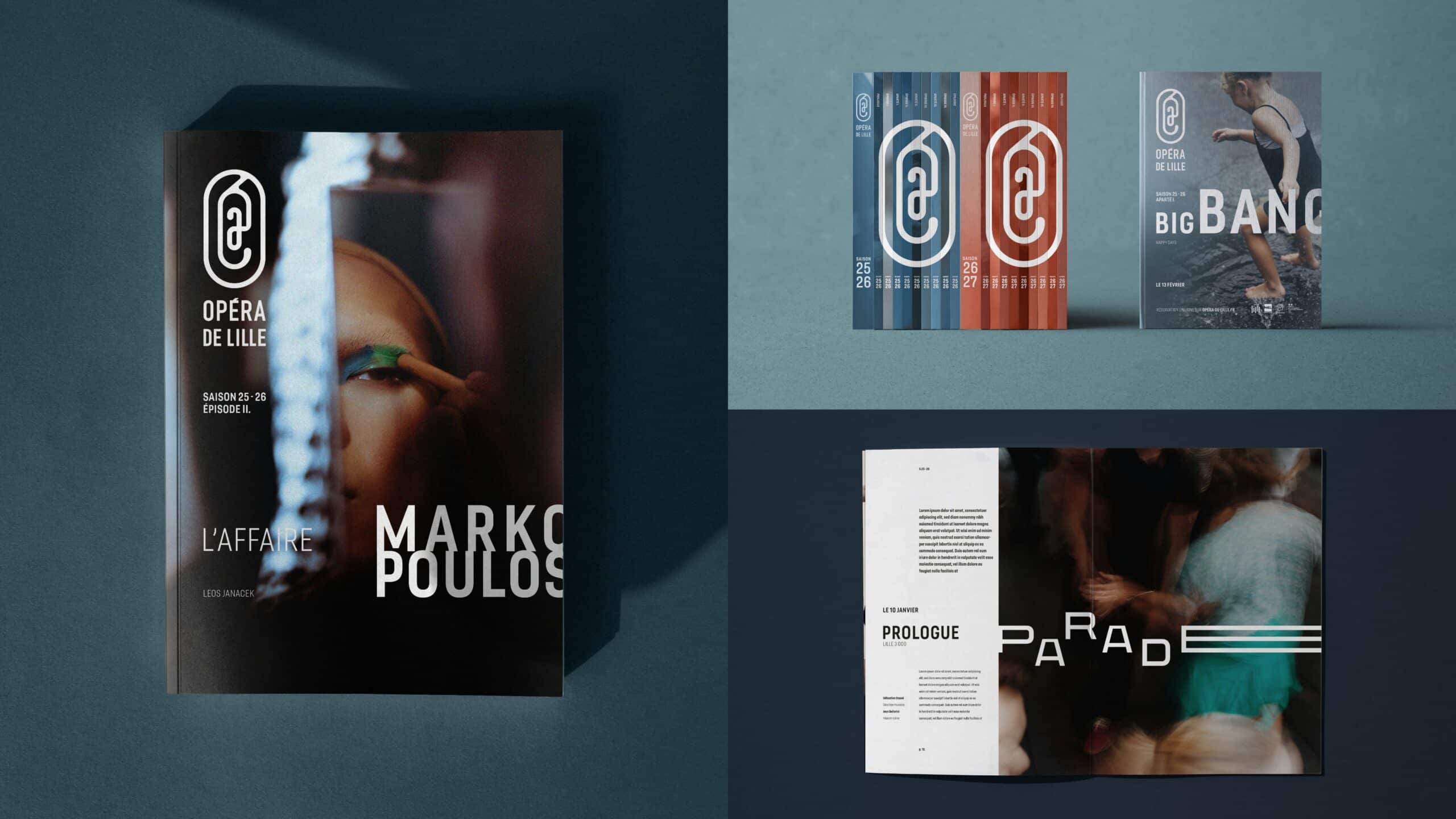
The logo, “the key to Lille,” is a landmark, our starting point. A symbol that unites and brings together all the sub-units into a coherent whole.
This symbol resonates within the walls of the Opera House and beyond, like a carillon.
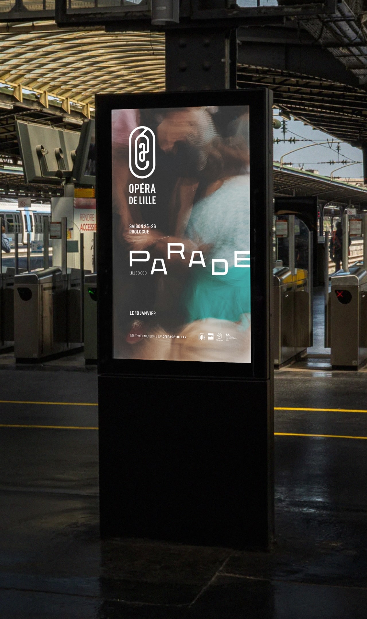
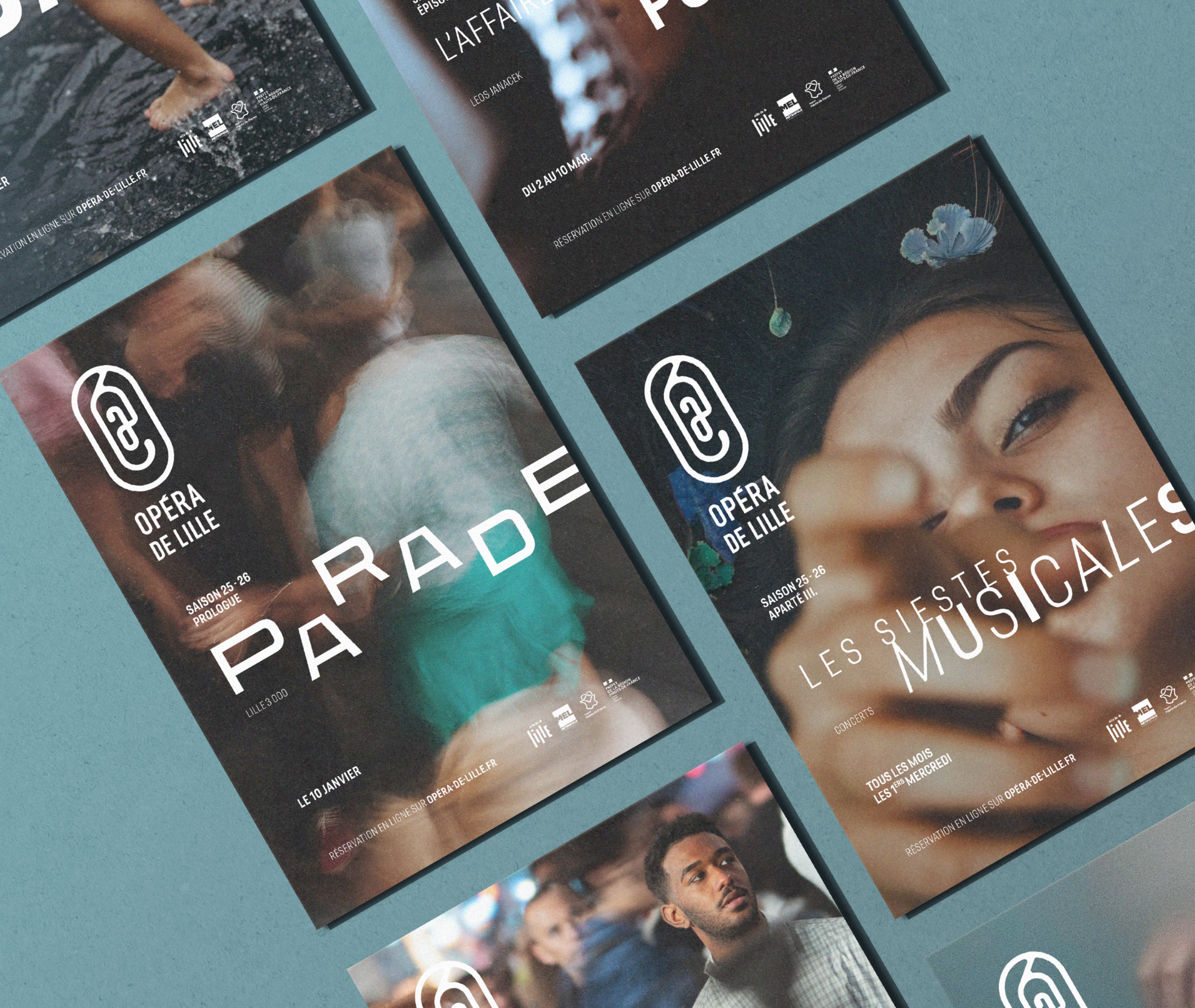
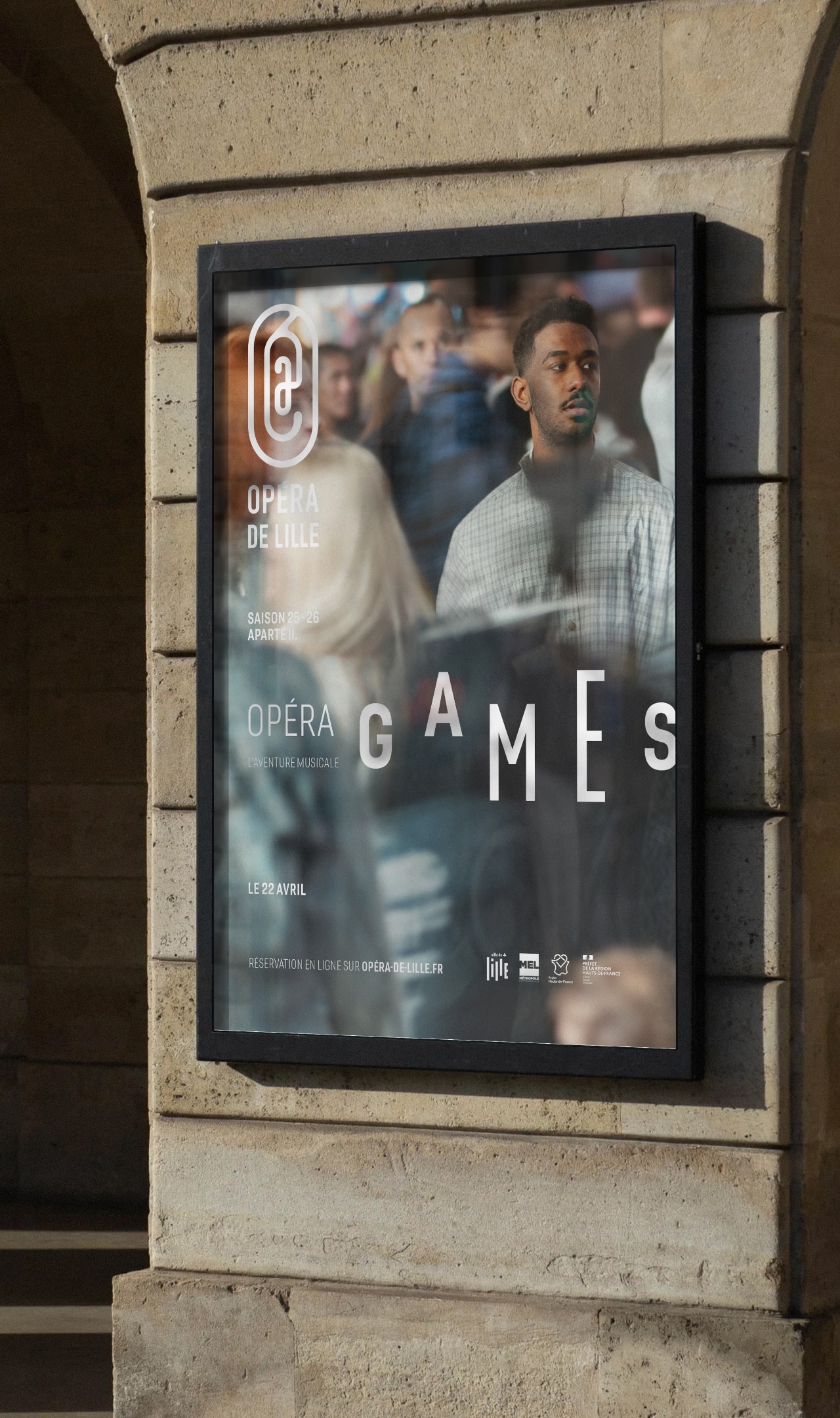
Visually, the human element is at the heart of the project because the opera is performed live and always addresses an audience. In all its forms, discreet in the shadows or in full light, alone or with others. The human element is the raison d’être of opera; it is appropriation through resemblance: empathy.
The human element is represented through a filter. It is the perspective, what draws attention through its plot or its intimate aspects. This filter is turbidity, the density of the air, the atmosphere we want to create. The filter is both the opera’s point of view and that of the spectator; it is the immersive dimension.
As in music, the color of a season represents the overall feeling of the theme.
Typography then provides the rhythm of the work, its intensity, through its variations, weights, and lengths.
Thus, these different criteria, marked by this symbol, allow for the creation of a graphic system resembling a musical staff.
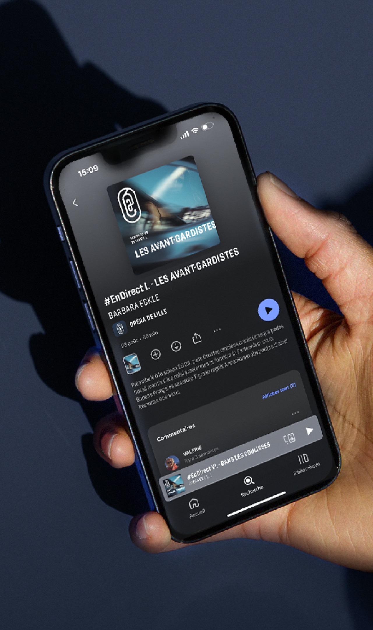
In parallel, the Opera House is more than just a venue; it’s also a platform for ideas, a connected and accessible sharing space for everyone, all the time.
All of the content was therefore conceived using motion design, a solution perfectly aligned with the vibrant and sonorous image of the brand identity and in harmony with the digital age.