Kempinski Identity
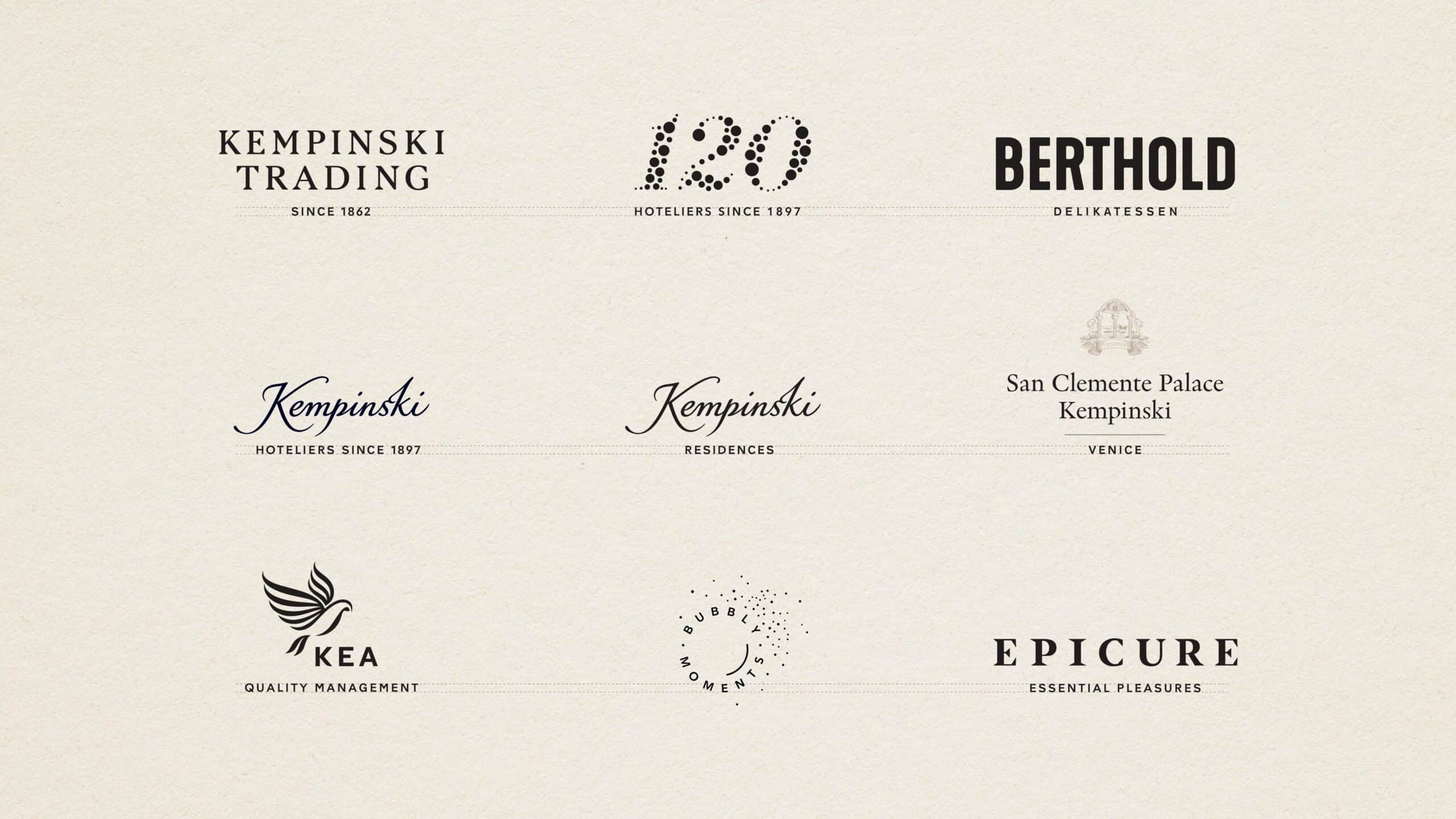
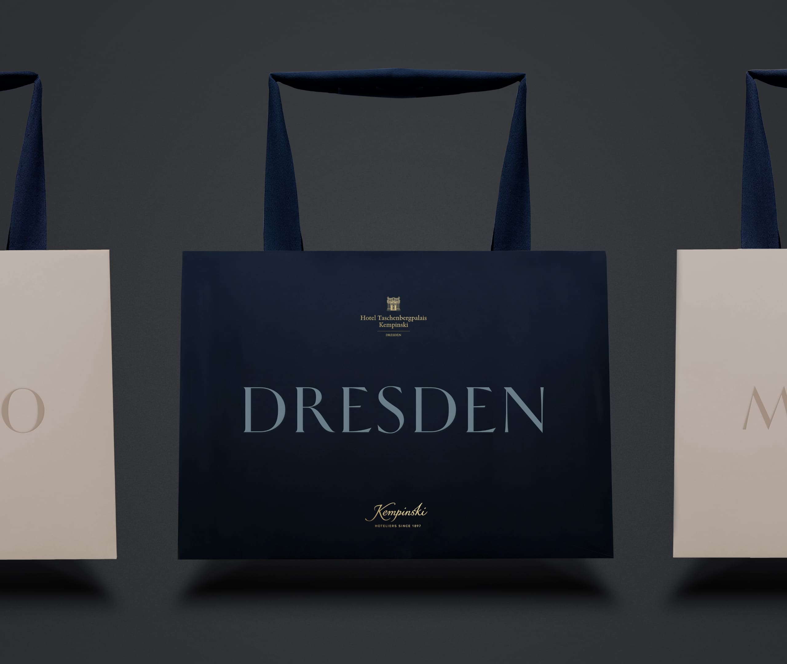
We have developed a refreshed brand identity for Kempinski, the luxury hospitality group. The new visual identity celebrates Kempinski’s heritage as pioneers of luxury hospitality in Europe with a contemporary look and feel.

It features a bespoke typeface, an ownable colour palette and a rich illustration style to express the sense of craftsmanship and timeless elegance that characterises Kemp

The identity is consistent, but also adaptable, with a unified visual language that works across the different destinations and regions where Kempinski operates.
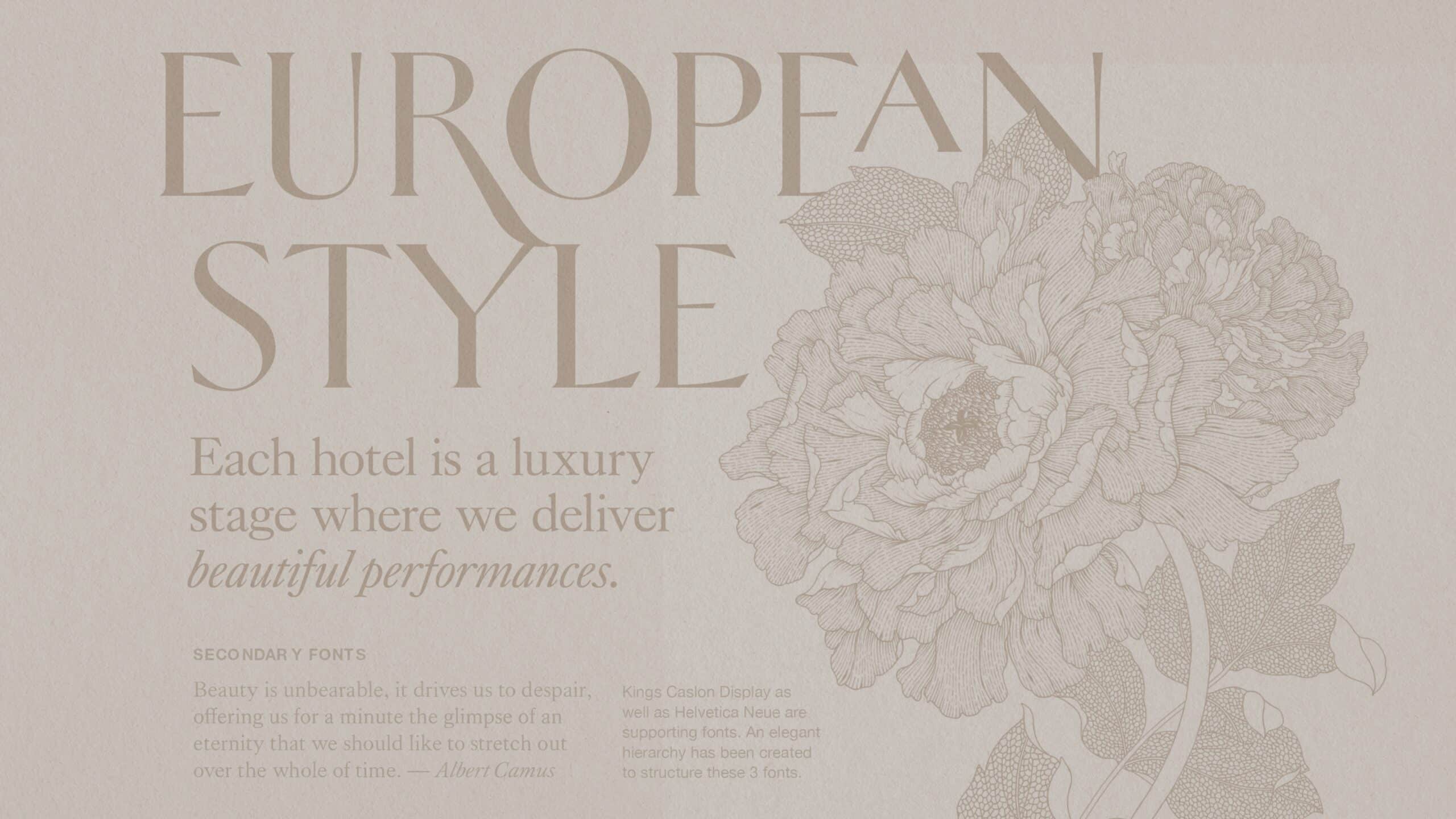


We worked in close collaboration with French typographer Mathieu Réguer to create a bespoke headline typeface – ‘HeleneHess’, named as a tribute to the wife of Berthold Kempinski. HeleneHess is an extensive latin serif font (with over 350 glyphs) that takes inspiration from the brand European Swiss-German roots. A custom-made sans-serif typeface sits alongside it to improve legibility and bring visual unity to a wide portfolio of sub-brands, products and services.
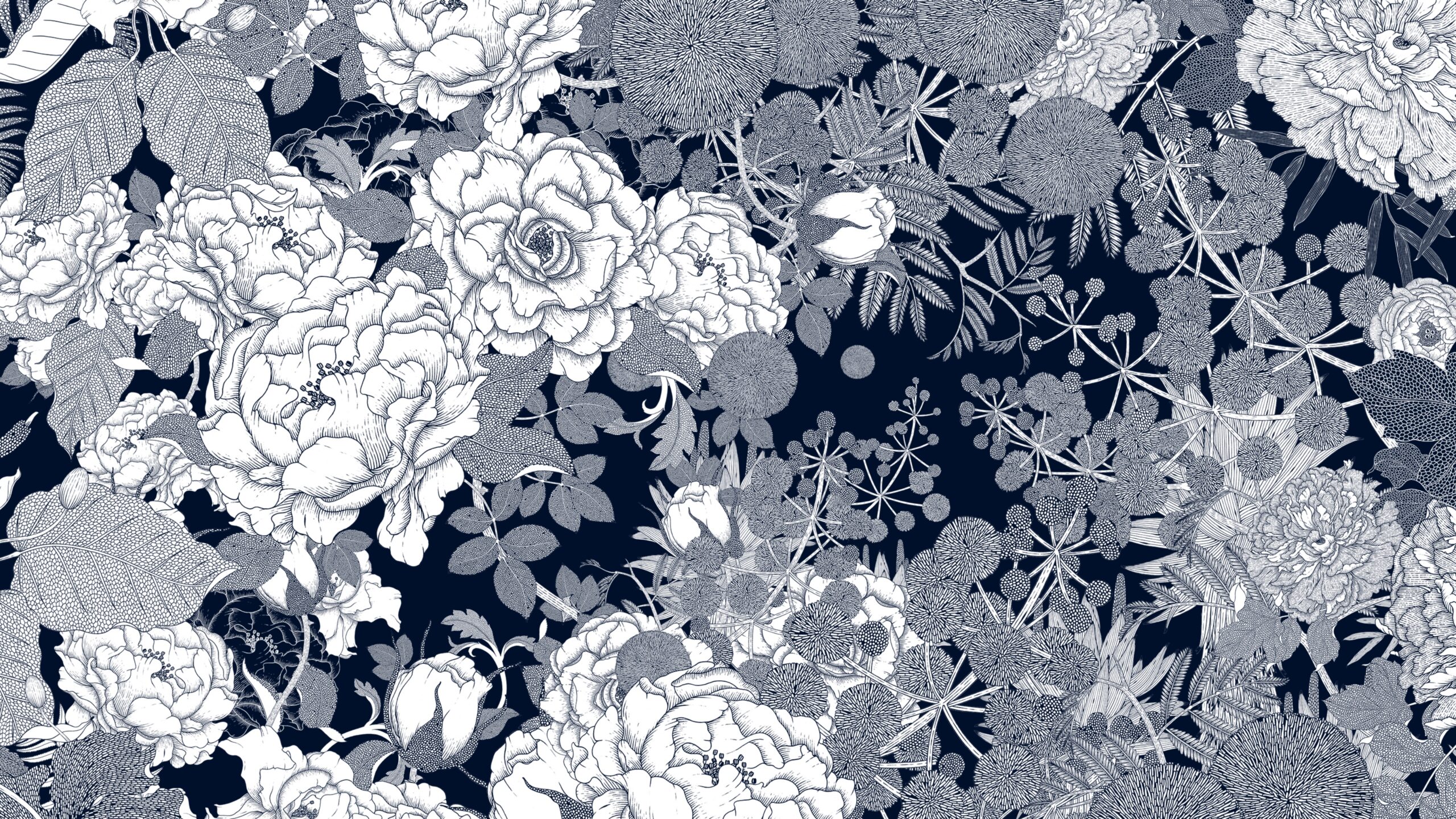
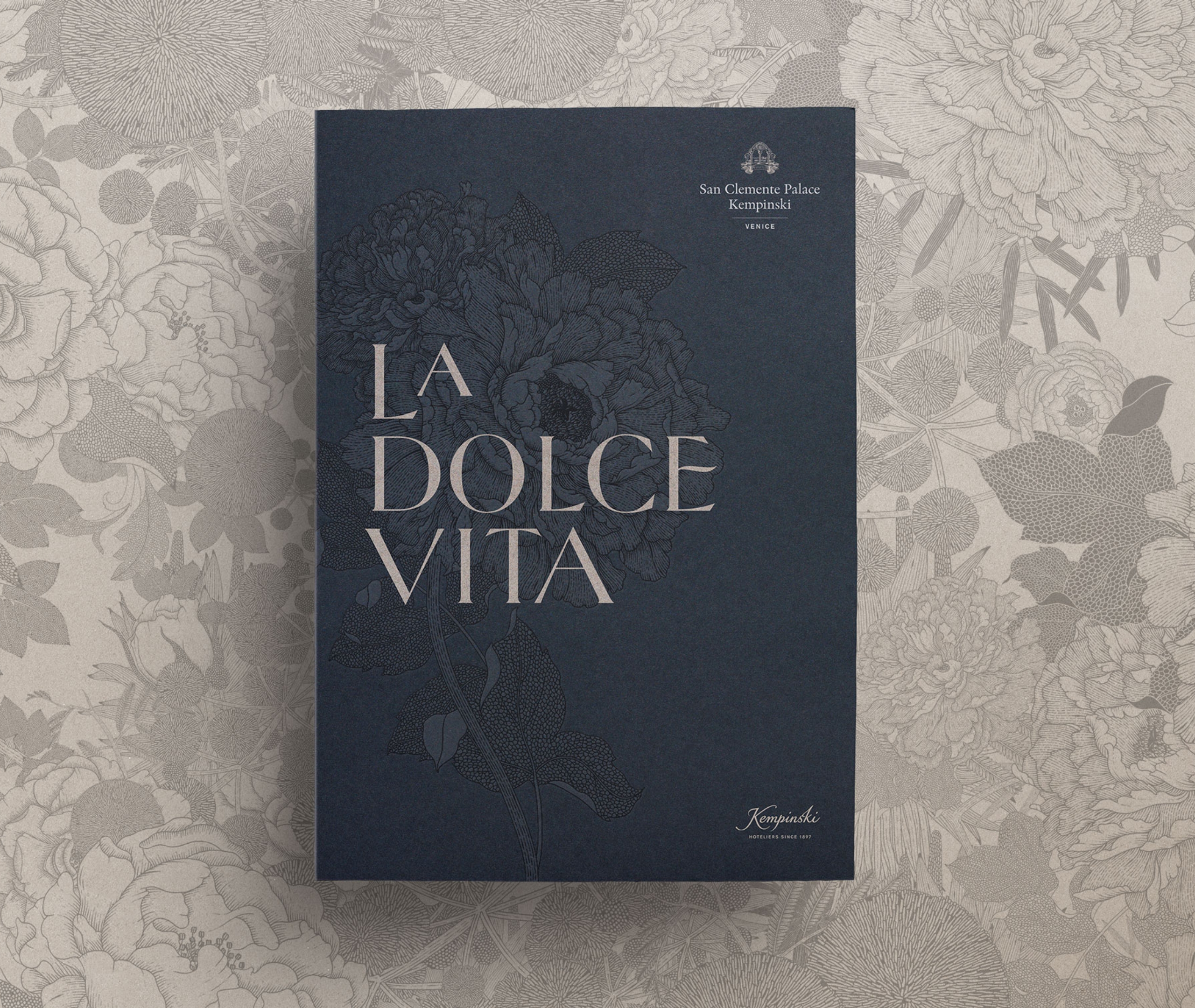
A bespoke set of illustrations, developed in collaboration with Thai illustrator Suthipa Kamyam further enriches the brand language when used as a pattern in printed materials. Entitled ‘Flowers of the World’, the illustrations feature a bouquet of four flowers, each a symbol of the regions where Kempinski operates in.


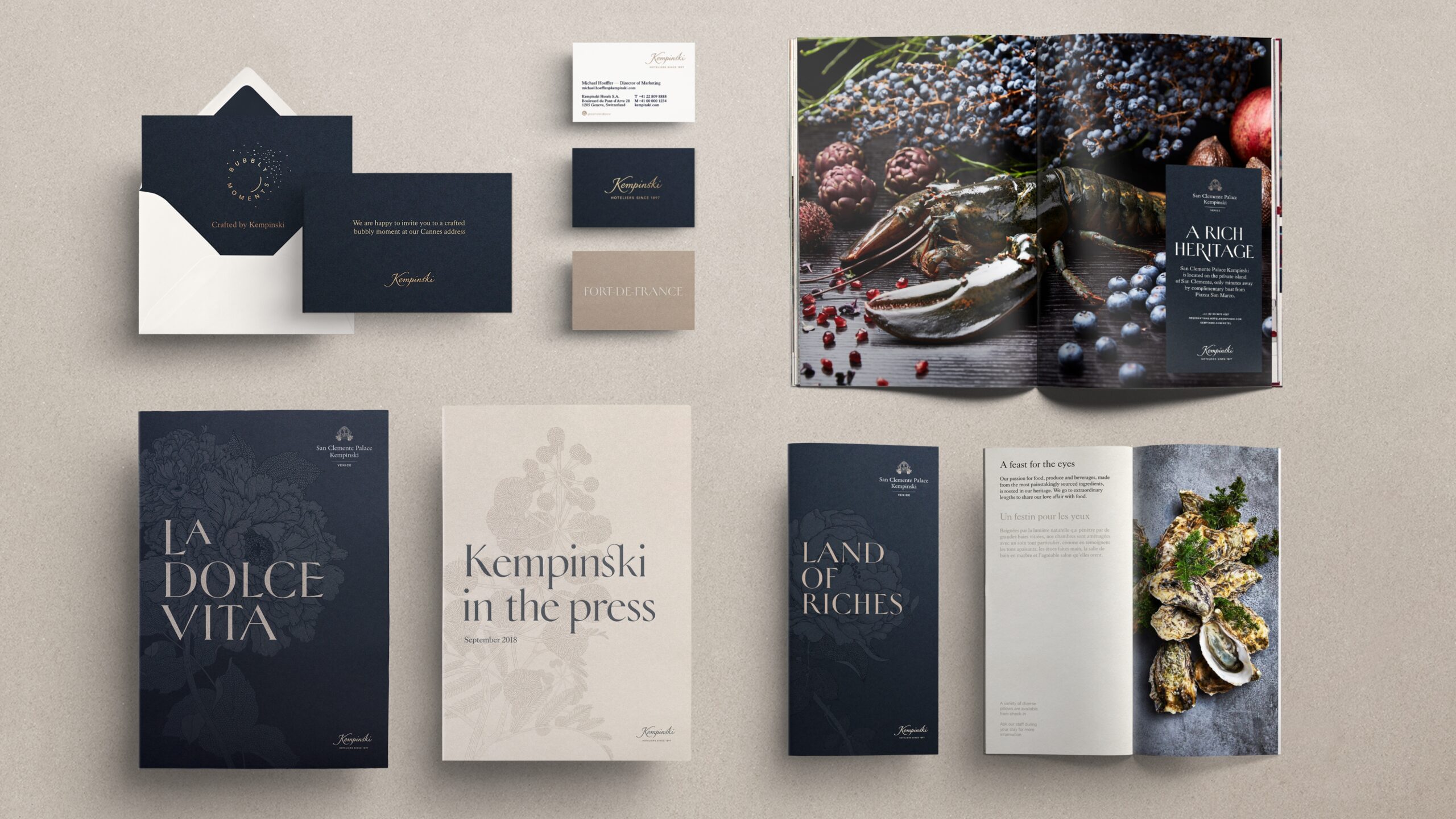
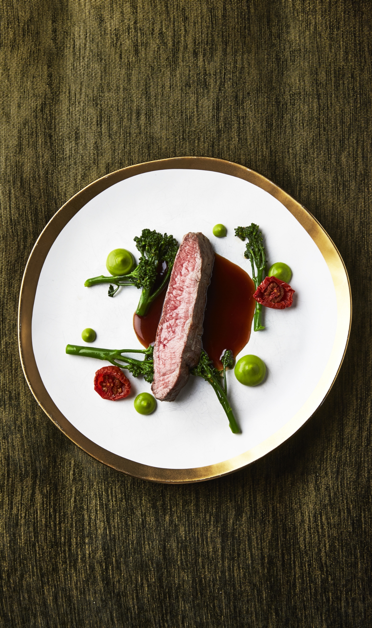
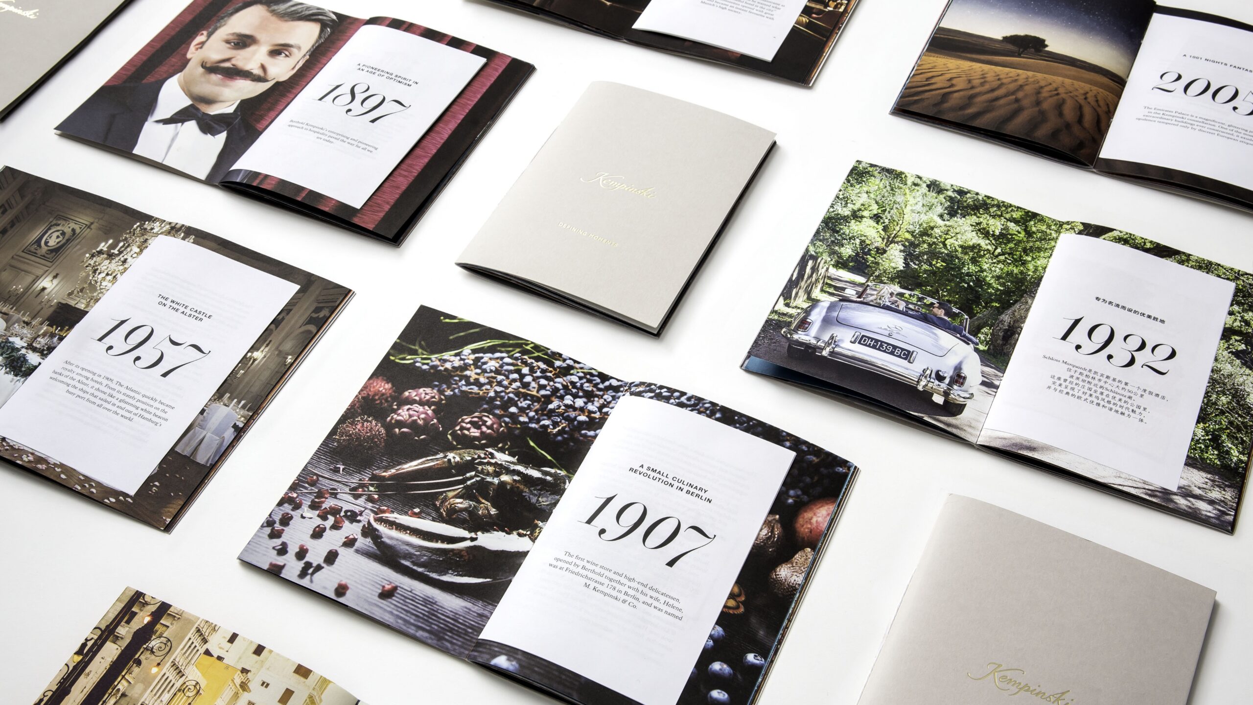
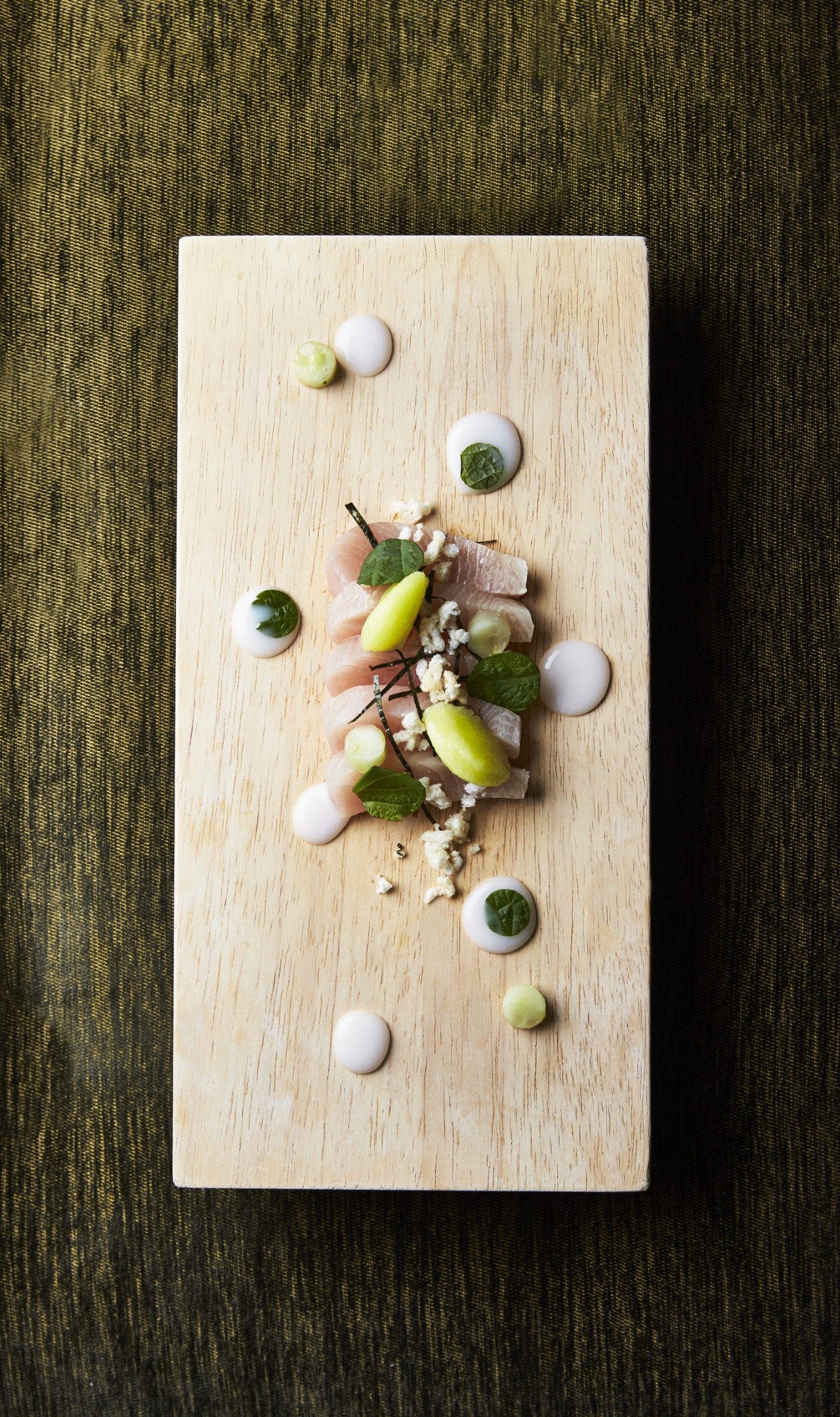
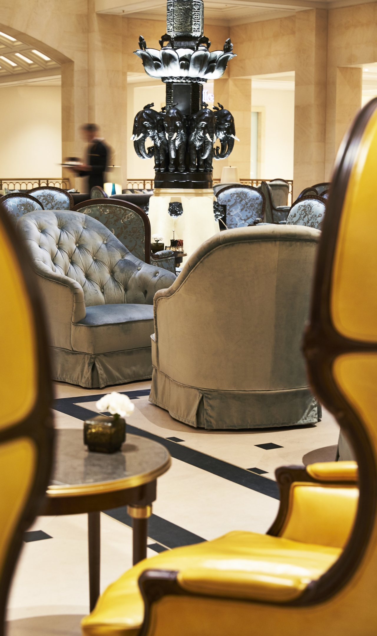
The visual style also includes a new approach to photography with rich and textured imagery that elicits emotion and elevates the everyday elements of the hotel experience into a piece of art. For gastronomy, WIPbrands teamed-up with Danish photographer Claes Bech-Poulsen to set a new standard for still-life photography. The photography of interiors also takes a new direction, with a human-centred approach that puts service at the heart of the experience.


© Les images présentées à l’intérieur du livre sont de propriété privée et appartiennent à Kempinski


